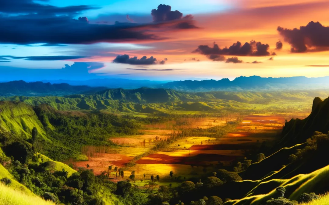
Unlock the secrets of color theory to elevate your photography. Explore how harnessing color can transform your images and captivate your audience.
Understanding the Basics of Color Theory
Colour is the heart of every photograph.
Understanding primary, secondary, and tertiary colours is where you begin. This trio forms the core foundation of the colour wheel, which is like your trusty map. This map leads you to deeper understanding, showing you how complementary colours are nestled opposite one another. It’s like discovering that perfect pair of shoes that complements your outfit effortlessly.
Exploring warm and cool tones changes the way you perceive mood and depth. Imagine a photo drenched in warm reds, evoking drama or passion, compared to one in cool blues that whispers serenity.
These elements do more than splash beauty—they set the stage for storytelling. Think of a summer beach scene. The warm sun will be the actor, highlighted by cooler blue tones in the waves. You get mood, contrast, and vibe in a single shot.
To improve your colour play, check out an article on using negative space effectively. It’s all about creating that right balance.
In the end, each colour choice adds a stroke to your photographic narrative.
Practical Application in Composition
Colour theory in photography is more than just a tool.
Now, let’s explore how contrasting and harmonising colours can direct focus and convey emotions. Think about how a rich blue background can make a vibrant orange subject pop. Contrasting colours are perfect for drawing the eye, while harmonising tones like greens and blues soothe it. They work together or against each other to create either tension or calmness, depending on the mood you’re after.
But what about using colour as a leading line? Imagine a winding path of warm yellow drawing the viewer’s eye straight to your subject. Or perhaps a splash of red can isolate your focal point, making it unmistakable. Simple tweaks to colour balance can shift the entire story of your photo.
I’ve seen photographers transform a dull scene into something captivating just by creatively adjusting colours. It’s not just an art, it’s a craft. Experiment, see how tweaking hues ignites your compositions. If you’re interested in taking it further, you might find this guide on backgrounds interesting.
Color Psychology and Its Impact
Colours have the power to stir deep emotions.
Think about how you feel when you see a bright red sports car zipping down the road. Red is often associated with energy, passion, or even danger. In photography, mastering the use of colour psychology involves understanding such nuances. This understanding enhances your story-telling, making your photos instantly resonate with viewers on an emotional level.
Review the calming charm of soft blues and greens. These colours evoke tranquillity, perhaps reminding us of a serene beachfront or the lush embrace of nature. You might want to experiment here, trying to capture such feelings in your work. Or, consider the happiness and warmth of yellows, like sunlight streaming through a window on a lazy morning. Each hue contributes differently.
Matching the right emotional tone, though, isn’t always straightforward. Sometimes it’s about trial and error. For insights into capturing emotions in portraits, this resource might inspire new directions. You might find unexpected combinations that amplify the intended mood, shaping perceptions subtly and ensuring your photograph’s impact lingers beyond mere aesthetics.
Leveraging Modern Tools and Techniques
Modern tools and techniques offer photographers precise colour control.
Take a second to imagine adjusting hues without the hassle of film. It sounds dreamy if you’re someone who remembers squinting through a loupe all day. Camera settings now embrace clicks and taps. Features enable fine-tuning colours with unprecedented accuracy. This is both exciting and a bit overwhelming. Sometimes it’s hard to know where to start.
The technology isn’t just limited to your camera. Editing tools like Adobe Lightroom have empowered photographers to tweak colours with finesse. You can easily correct saturation or experiment with unique palettes tailored to your creative vision. By balancing contrast and brightness, you’re opening a whole realm of opportunities. There’s also something inherently satisfying about perfecting an image’s colours until it feels just right.
Don’t be afraid to experiment. Beginner’s guides are a great place to start if you’re learning the ropes. The world of modern digital photography offers endless possibilities and sometimes it’s almost like crafting magic.
Becoming a Color-Savvy Photographer
The magic of becoming a colour-savvy photographer lies in your willingness to experiment. The more you play with colours, the more you learn about their impact on emotions and storytelling.
Often, the best way to master colour is through observation. Spend time studying successful photographs and recognise what draws you in. Perhaps you’ve noticed a certain warmth in a series of portraits or an unexpected colour clash that adds tension to a landscape. Observe these patterns and ask yourself why they work.
To really hone your skills, consider joining workshops focused on colour theory or using resources like the Beginner’s Guide to Editing Photos in Lightroom. These can offer structured ways to dive deeper.
Feel free to reach out through the contact page for help in mastering colour in your photography. Even experienced photographers might find new insights by bouncing ideas off others. Maybe that’s what you need right now: a little push towards a new perspective.
Final words
Color theory is a game-changer for photographers seeking to create impactful images. By understanding and applying these principles, you can elevate your storytelling and connect deeply with viewers. Incorporating modern tools and strategic color usage will empower your photographic journey.

